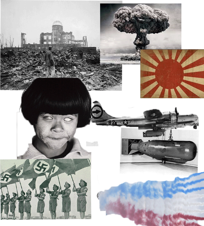
This is my one of my three concept (past future present, the past event is WW2 atomic bombing of hiroshima and nagasaki. i used photos that are associated with the event such as the planes, bomb and children deformation.
my idea for this postcards is to get a black and white background of hiroshima, then to add color to it, adding a destroyed city scenary, giving it the that post opocypctic feeling. I will also add iconic objects and things of the event such as the standing shinto shrine and child victims of the bombings. im thinking of using different textures of broken shrapnel and buildings, to give that epocolyptic look also use dark colours to give that dramatic efect. one concern is that this may give the feeling of it looking like an dystopian future but my planned idea is for people to feel like they was at hiroshima when it happened and you saw all the colors of destruction and debree.
My idea for present event is, the 2013 e3 sony ps4 and microsoft xbox conference. the theme will the time period before the new consoles came out and the contreversy of which console will be better.
my ideas is to put a symbolic backround that has 2 sides (ps4 and xbox one) and have iconic exclusive game characters lined up and look as if they are going to war, i want to add and blend in the ps4 and xbox logo and colours to the armor, skin and clothes to show what side they repersent and giving that idea of to sides are competing with one another.
This was the first task for unit 1; it was a composited image of stone henge and a sky for a background. We use the quick select tools in order to choose what parts we wanted to get rid of. And I put the new sky as a layer under the stone henge photo, then we used a layer mask on the top layer getting rid of the selected area but unlike using the delete button you can bring it back. this gives the effect of a sky replacement. This excersise helped me because i will using this technuiqe for my final pruduct. for things like to change the scenery of one place to make it dramatic, I could also use this technuiqe to change it to any type of background not just a sky.
Unit 1
Intoduction to Visual language for Art and Design


My idea for the future event would be an era where humans and robots live together in harmony within an furtiristic utopia of a city, they can also interbreed together. My inspartions are from movies
like irobot, terminator, metropolis and games such as dues ex. my idea for this postcard is to have a familly where one parent is human, the other robot and the child being both, walking in a futuristic utopia added thing like floating cars and thing that signifies the city


Green screen avtivity


Abandoned building
Past. Present and future postcards
past concept mood board
present moodboard
E3 ps4 and Xbox one
future moodboard
photoshop technuiqes and activities
sky replacement
In this Photoshop activity, I learned and demonstrated multiple techniques in order give a picture of a building an abandoned, burned down look to it.
The first thing we did to the building was giving it a sky replacement. We did this to give it dramatic scenery and to enhance the feeling of destruction; also an old very abandoned building wouldn’t look right in a sunny bright background. The way we did this was that we used the Quick Select tool to select the part of the sky we wanted to change, put the sky image we wanted as a layer under the buildings and added a layer mask to the top of the layer revealing the new stormy sky replacing the old.
One thing i think might be a problem is that the shading and colour tones of different character might be too obvious and that there from different images. one thing i could do is to put a one colour fill an change the opacity to give that on hue layer
Next what we did is we got an image of a rust texture and added this texture to the building its self, this gave the building its main texture and really gave it that abandoned feeling. We did this by firstly using the quick selected tool outline we used for the sky replacement, and put the layer of the rust on top and then added a layer mask so that the rust is only covering the building, In order to blend it in the building. I changed it to an Overlay. Then I used to burn tool to darken certain parts. I then used a brush that I downloaded that gave the pattern and effect of vines, I used this on things like the window seals and to give that foliage look enhancing that abandoned building effect.
This is a montage by artist david hockney called pear blossom highway. It was created 11-18th April 1986, by him. David Hockney was born in Bradford, England, on July 9, 1937. He does a variety of work from paintings to montages and photography. This piece in particular is a ‘joiner’ an assemblage of Polaroid photos laid out in a grid. It consist of over 50 photos of one event, in different angles and perspectives, he then put them together into one seamless image, hockney's work has the same ideology as the art movement of cubism that you can see different angles of a thing in one composition. You get this sense of like the Wild West or the great American road trip, due the wide-open desert like plains. As you can see hockney added signs and post on one side, the right side, American driving side, and just plants and rubbish on the passenger side. He uses the to symbolise the different perspective people have while there in same place but experiencing different things, how the diver has to focus at all time and watch closely for all the signs, while the passenger sits back and doesn’t notice anything but scenery. The way it will help me for my postcard project is the way he placed his symbolised object, I could use his idea of two different perspectives in my postcards to show the different way people saw the Hiroshima incident at the time

Dadaism is an art movement in the early 20th century, it was a negative response to the madness of world war 1, the movement concentrated on anti political and war themes and had the mind-set of that artist should not be doing art while the madness of world war 1 Is afoot. Dadaist imitated the art technique of cutting shapes of paper from the cubist movement and adapted it to be the first kind of montage. The feeling I get from these types of montages is like a crazy type of madness they saw in World War 1 and how everything in politics and society was frantic. The way this will help me in my work is that I will be doing a montage type composition of a war, I could use the same sought of style to get that crazy and frantic theme of war in my own work. As you can see in this piece it’s a composition made up of many images having symbolic items to try to get their word of madness across, they also have placed different images connected to one another, like different faces on people to give the affect of its all one big image. This will help me with my work such as symbolic objects like the Nazi flag in Hiroshima and the logos for my e3 postcards.

This composition was created by artist John Stezaker, John was Born 1949, in Worcester and now Lives and works in London, UK, John mostly works with compositions with 2 images and finds a way on how these 2 relate and places them to make then look as one seamless image, you get this scene and feel as its one image as you can see the shape of the mountains take shape like the faces, this can help my work by helping me understand how to get 2 images and make seem as one, this will help for my future postcard while I’m trying to add parts to the human form and robot parts to make one seamless image of androids, of course ill be using more digital techniques to make a more seamless image by overlaying over each other but I’m using the same idea of manipulating photos.

this montage, was done by artist rodchencko, rodchencko was a Russian artist, sculptor and photographer, he was one of the most versatile and constructive artist to emerge from the soviet revolution, in this piece he did it was a montage of a face and the world on his mind, like many artist hes using images as symbols for a message he wants to get across, but the in his work different is the colour manipulations in his work. As you can see in this image he used different colours on images that would usually be in black and white, and added them subtlety so theres no strong colors covering the image, this will help to add colour to many of my images that are in black and white in my first postcard, this will give me an understanding of what the images may look in colour, I think the colour helps give his montage a feeling of that older soviet feel especially the red adding that feeling


Initial Research


this is my final piece for my past event postcard, it's a postcard of what Hiroshima would-be like if you were there, but if you can also see the ghost figures of the victims of the incident. research I have done that has influenced me are movements like Dadaism, their main focus is their negative reaction toward the madness of world war one, I have a similar theme, mine is the tragedy of the Hiroshima bombings, other research that had influenced me are artist like hockney and rodchencko, the way these artists had helped is by the style of their own montages, David hockney put certain objects in certain places as a symbol to show experience or feeling, an example is pear blossom highway and the diver v passengers perspective, in my case the symbolic images of the Hiroshima bombing, the Shinto shrine, the deformed people and the Enola gay, also how rodchencko used color to get his feeling emotion across, in my case color the image to give experience of what it would be like to be there and how people saw it instead of black and white. I used Photoshop to create this composition. I started off with an image of Hiroshima, and I added a sky replacement with the quick select and layer mask tool, then I added in buildings to fill the skyline and to add to that destroyed effect, then I started adding color on a new layer with the paint tool and then change the overlay and the opacity giving color to the image .
I then added texture of broken pavements on to the floor, enhancing that destruction look, also with old destroyed brick textures on the houses and buildings. I then added symbolic items to the image,(Shinto shrine, Nazi flag) to tell the story of the event in the image, I used the quick select tool and the layer mask tool to do this, to finish I used the fill tool to add one color all over the screen and then changed the opacity to give it this hue affect to the image, I think that the coloring of the imaged worked well, it really brought the image to life, making look modern even, I think I could of worked on the symbolic objects to blend them in better and make them more noticeable to tell the story better. The thing I would changed are some of the images i had used, ones that blend in more, overall i am happy with the piece
past postcard final piece breakdown

postcard experiment
this was my initial idea for my present day postcard, the theme was the 2013 e3 ps4 and xbox conference, my idea was to make the 2 conferences as if they at war with each other, , as you can see I used two pictures that were almost a top down view, of both conference, I put the two images on top of one another and changed the overlay in order to get the effect of the merged together, I then used the coloring technique of adding color on a layer on top of the image and changing the overlay and opacity, to color the crowed at the bottom, I was aiming to get this symbolism of 2 sided supporting the different companies product, sought of like rodchenkos's work,
I then added characters which are from games which are playstationand xbox 'exclusives' making the image symbolic as sought of like their soldiers of each side fighting each over. the reason why i did not like this composition is because of the selection of the images.
these images were original too dark making my alteration unnoticeable, also the angle of the background image made hard to find character to match the angle, and I think that story or message I was trying to tell was not being told through these images. also the playstation side looks as if its hidden by the xbox sign . also I did not like this piece but I think it's good practice and a good test run for the final piece. I can now use this as a reference image of what kind of theme i am going for


pesent postcard breakdown
This is my present day final piece, the research on artist rodchenko and the Dadaism art movement influenced me by the ways they used colors and images symbolizing there work and to get their message across, I used colors to differentiate two sides (ps4, xbox one), this technique I got from researching rodchncko work, and also adde different images placed together to look as one, one example is the playstation logo on the tank, you can see this simmilar to some of Dadaist collage where they merge images to make one seamless composition, also similar work to john steazeker.
I used Photoshop to create this compositions, firstly I got them image of e3 and added a sky replacement, I used the quick select tool to select the sky, I added a new sky under the building layer, and then added a layer mask,I then proceeded to color the panels of the building using the paint tool on another layer and then changed the overlay and opacity of the paint making seem as if the panels are colored, I used these color to symbolize two sides,
I then added subtle details such as broken glass and bullet holes to signify that there war and give it that destroyed look buildings have in war. I used to quick select tool and and overlay tool to do this. I then added the characters from different console exclusives, I wanted to have that soldier uniform look so I used halo Spartan soldiers for xbox, and killzone helgast soldiers for playstation, this ties in with my david hockney research, using different things to shows too different perspectives or in my case two diffirent sides. lastly I added a hue layer to get all the character the same color effect so the composition looks more seamless. I think that I could of conveyed my message better, with better placement and choice of images, although I what did go well is that the image has that madness and franticness of war. Im happy how well that the characters blended in especially with the color hue. overall I think I could of used better images to convey my message more

postcard experiment
this was my future day postcard experiment, this experiment was to help me practice the techniques of turning people into cyborgs, my inspirations for the idea, are from movies and games I researched for my future mood board, and the technique I learned to do this are from YouTube tutorials and class work Photoshop practice, the way I achieved this was I firstly had to add the lines on the skin for the main robotic part look, I used the pen tool to create anchor point then I adjusted the paint tool to the size and color I wanted, switched back to the pen tool and used the stoke fill option and pressed the paintbrush option adding the line.
I then had the use the FX options to give it inner and drop shadow and a gradient overly to give that realistic line look and to blend it in, I then smoothened her skin of any spots or wrinkles to and added a silver colored paint giving that metal look.
finally I got a shiny metal texture found online and put the layer on top of the woman and changed the overlay to give that light reflection look. i think this techniques works for me and the idea I have for my final postcard


future postcard
breakdown
I firstly got picture of a family, and started working on the mother and children using the same pen and paint brush techniques to create the robotic lines, on the mother and children, changing the FX option giving it inner and drop shadow to blend them in, I then used the blur tool to blur any skin imperfections and the silver paint to color them in, I then added the shiny metal texture to give them that metal look, after finishing the robots, added a sky replacement, using the quick select and mask tool and a picture of a futuristic utopia behind the layer. after that I added smaller details like the color of the grass and the dogs eye with the color tool and FX options, and finished it off with a blue hue, using the paint fill and changing the opacity. I think the techniques I used conveyed the story I wanted, especially the robot effects, how the mother looks like a full robot and the kids look like robot human hybrids, showing how that robots could interbreed. what I would change is the background, I could of added more work to it, editing normal building making them futuristic, but i thought that may of took eyes off the family and the idea of humans and robots families which was the main focus, overall I am happy with the final piece, especially with the robot look of the woman.
This is my final postcard, it's my postcard of a future where humans and robots can actually interbreed, the researched I done on movies such as irobot and also research on Dadaism has influenced me and helped me create this composition, the research on cyborg movies helped me gain an understanding what robots look like and how my attempts of making robots would look, and Dadaism by how to put objects on the human form and to blend them together so they look seamlessly as one,
other researched that helped were from YouTube videos on how to make cyborgs in Photoshop and primary experiments. as the same in my previous experiment I used the same technique to get that robotic look,
This was a technuiqe we did as a classroom activity these images are to demonstrate how to use the colour pick tool in photoshop to create a compisited image of an object in front of a green screen and also a background image, i also use the saturation tool to get rid of areas with colour bleeding. this technuiqe will be useful when i have images over the greenscreen and need to place the object on background, also this technuiqe is more acurrate and 'cleaner' than using the quick select tool. only problem some images dont have a green screan behind it